
Identifying Financially Vulnerable Customers using Smart-Meter Data
I was quite saddened when a friend at the Felix Project (a charity fighting food poverty) recently told me that some food bank users are refusing to accept potatoes because they cannot afford the energy required to boil them. In the face of an unprecedented increase in wholesale market prices, which forced the regulator to increase the energy price cap in April 2022, it has never been more important for suppliers to identify and extend help to financially vulnerable customers.
At EDF, we have always been committed to helping vulnerable customers access the support they need. We have been a part of Energy UK’s vulnerability commitment since its inception in January 2021 and have worked hard to uphold its key principles of (1) improving customer accessibility to proper support and continued supply in vulnerable circumstances, (2) working in collaboration with consumer groups, customers, other suppliers, and third-parties to improve outcomes for vulnerable customers and (3) innovation, to continuously improve the level of service provided to vulnerable households.
This year, the Debt team in Customer Operations and the Data Science Team at EDF are striving to uphold the principle of innovation by developing a data-driven tool to detect signs of financial vulnerability among our smart pay-as-you-go customers. As members of the product team developing this tool, in this blog post, we wanted to share a little bit about the product development process and how we worked with stakeholders to address a pertinent business challenge.
Our Team and Ways of Working
Our Agile product team is composed mainly of data scientists working with a product lead to research the problem, explore the available data, and create a proof of concept (POC) product. The team is mainly remote and since our work requires a lot of collaboration and brainstorming, we make use of Slack, Google Meet, and Miro on a daily basis.
Although each member of the team works autonomously on their own tasks, total transparency is preserved by using a Kanban board to track the team’s workload. While researching the problem and shaping the POC product, we found it incredibly useful to involve stakeholders in the process. And most importantly, we engage in regular backlog refinement sessions that help us realign our priorities as we receive new data, requirements, or feedback from stakeholders.
Step 1: Understanding the Problem and Organising the Data Available
Before we could start creating a solution to help identify signs of financial distress in our pay-as-you-go portfolio of customers, we first had to better understand the challenge they were facing and the support that is currently in place to help them. The entire product team participated in these collaborative exercises with stakeholders from the business, paying special attention to understanding what self-rationing and self-disconnection behaviour might look like. We also learnt about other aspects of the pay-as-you-go functionality such as self-disconnection alerts, low-balance alerts, auto top-up payments, emergency credit and non-disconnection periods, all of which helped us gain a better understanding of the challenge and available data points for our analysis.
The outcomes of these collaborative research sessions were as follows:
- There is a pressing need to use a data-driven approach to identify if a customer is showing signs of financial vulnerability through their behaviour
- Several useful sources of customer data exist for our product and a variety of modelling approaches could prove useful. Therefore, it is important that we prioritise the approaches that we wish to take to deliver value as soon as possible
Based on the information gleaned from these collaborative sessions and some sample data that we had received from the business, we started to create a table of data elements that might prove useful during product development. The table also contained information about how easy it would be to get hold of good quality data and ingest it into our big data environment.
Next, the entire product team collaborated on Miro to generate a list of useful features for hypothetical models which we then organised into a model feature complexity map. The map grouped features based on two criteria: complexity and achievability (time-wise based on data availability).
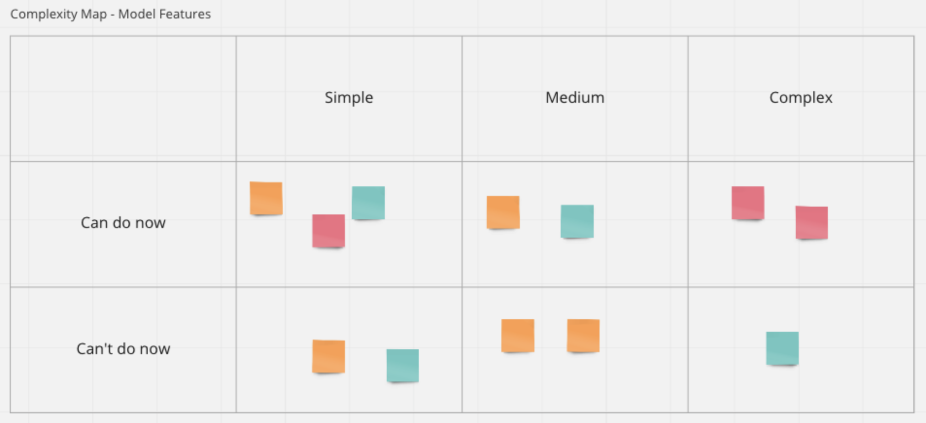
On the back of the aforementioned data and feature categorisation exercise, we soon realised that customer smart-meter and transactional data were easily accessible in a form that would be fit for exploratory analysis, and useful for feature generation and modelling.
The next step in the process was a thorough exploration of customer smart-meter and transactional data to gain a detailed understanding of the data quality, distributions, summary statistics and relationships between behavioural data points.
Step 2: Exploratory Analysis and Communication of Results with Stakeholders
Exploratory analysis is always a fun step in every data science project since, to paraphrase the statistician John Tukey, one gets to take boring flat data and bring it to life through the power of visualisation. During this phase of the process, we spent a good chunk of time understanding the different data points available in the customer smart-meter and transactional data and classifying them into two broad categories: (1) unique identifiers that could be used to create joins between datasets and (2) data that contains information about customer behaviour.
The next step in the process was to examine summary statistics, plot distributions, identify outliers and impute/remove missing data. Then, using Plotly's Python graphing library, we created interactive customer behavioural journeys using mainly time-series data from smart-meters and transactions. We did this because we hypothesised that a subject matter expert might be able to discern signs of financial vulnerability by looking over a customer’s behavioural journey.
After creating interactive customer journeys for a sample of customers, we organised our results into a dashboard on Miro and presented them to our stakeholders. While we received positive feedback about the informational value of these dashboards, it was decided that a more automated approach would be needed to systematically identify a group of financially vulnerable customers from behavioural data.
Step 3: Brainstorming and Prioritisation of Modelling Approaches
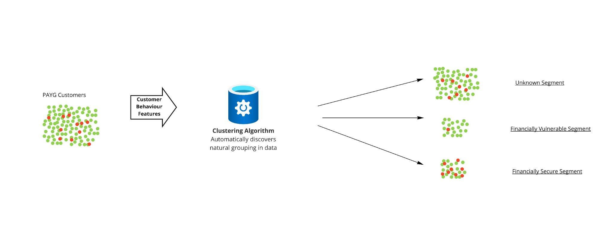
Following a session identifying potential data-driven solutions and considering their feasibility, it was determined that the best approach would be to perform a clustering analysis based on a well-chosen set of behavioural features.
Clustering analysis is the task of segmenting objects such that objects within a segment are more similar to each other than to those in other segments. It is a form of unsupervised machine learning, critically meaning that it does not require labelled data.
The reason that clustering was deemed the most appropriate of all the potential solutions is that we did not have a true indicator of financial vulnerability in our dataset. Another benefit of this approach was that the methodology is relatively transparent in deciding clusters, and also the simplicity of the approach meant that it was relatively easy to produce quickly.
Step 4: Developing the Clustering Analysis
Informed by exploratory analysis and experimentation, several behavioural features indicative of financial vulnerability were engineered from smart-meter data which, when utilised by a clustering algorithm, resulted in several customer segments.
To label and evaluate the generated segments, we had two methods at our disposal. The first is that we were able to analyse the proportion of customers in each segment who were financially vulnerable according to the Priority Services Register, which is an imperfect and incomplete flag for financial vulnerability, but still useful for evaluation purposes. A reason that the flag is incomplete is that people may not be aware that we can offer help or that they are too ashamed to request help. Indeed, there was a significant difference between each segment, and we were able to use this metric to gain an insight into each segment. Furthermore, the second method of evaluation was to use various visualisations that represented the customers in each segment; when these visualisations were shared with subject matter experts, they were able to confidently describe the type of customer each segment represented. An important segment identified by the subject matter experts was one seeming to contain financially vulnerable customers.
Conclusion
The model is currently being productionised so that the analysis can be performed and monitored on a regular basis, to provide the best possible help to our customers. Once productionised, this tool will be used in addition to our current processes to help our customers.
We look forward to producing more content detailing the productionisation process once completed, as well as explaining any iterative improvements to the model.
Post a comment
Related articles

EDF's Open Tariff APIs

